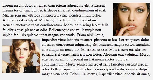
By default, DIV element in HTML occupies the entire width available to it. That is to say that, unless controlled, default width of DIV is always 100%. As a result, DIV element pushes other elements in its way down. You can control the width of the DIV element (let’s say you make it 50%). Although DIV will follow your command and occupy only 50% of width –but it will still not allow other elements to wrap around it. At times, we need to wrap text around a DIV. In such cases, CSS property float comes to our rescue. This property float forces DIV to give space to other elements on its sides. Let’s see how to use float to wrap text around a DIV. Remember, float property can either have left or right as value. In the following image, two DIVs containing pictures are floated left and right. As a result the surrounding text is neatly wrapping around the DIV. BONUS TIP: Using float property you can adjust two or more DIV elements side-by-side (adjacent to each other) Now let’s see the actual demo of the above given code. I hope this tip was useful for you. Please let me know if you have any question or doubt about it. Thank you for using TechWelkin. Lorem ipsum dolor sit amet, consectetur adipiscing elit. Praesent magna tortor, tincidunt ac tristique sit amet, condimentum ut erat. Mauris sem mi, ultrices et hendrerit vitae, hendrerit non tortor. Aliquam erat volutpat. Morbi eget leo lorem, ut placerat nisl. Aenean auctor volutpat condimentum. Morbi adipiscing leo et felis faucibus suscipit nec at odio. Pellentesque convallis turpis non sapien facilisis quis volutpat magna venenatis. Etiam nisi metus, imperdiet vitae lobortis sit amet, pharetra ut leo. Comment * Name * Email * Website
Δ